As the 2020 season turns there’s plenty of ongoing changes in the Top 100. Things are very very good for some players, and bad and getting worse for others. Six players have left the list which means six have jumped on. #80 Jonathan Schoop, #85 Pedro Severino, #89 Austin Nola, #90 Renato Nunez, welcome back #92 Eugenio Suarez and #99 Kyle Tucker. These guys are obviously killing it in various degrees of goodness. In particular perhaps it’s time to take Baltimore seriously. With all those Yankee injuries, and all the great performances by various Orioles, it’s no wonder the Rays are looking to be active in the trade market. Those dropping off include Mike Moustakas, Ramon Laureano, Eduardo Escobar, Gleyber Torres and unfortunately Josh Bell. I have defended several of these players recently but their struggles, and the good play by so many others, have made these moves inevitable. As Suarez shows, a week or two of good play can make all the difference. You can find last week’s list here. Now on to the details for some of the movers this week.
Please, blog, may I have some more?Learn more about our 2026 Fantasy Baseball Subscriptions!
The best daily/weekly player rankings/projections (hitters, starters, and relievers) for each of the next 7-10 days + next calendar week starting Friday. Kick-ass DFS lineup optimizer and projections for DraftKings, FanDuel, and Yahoo!.
I don’t have enough spam, give me the Razzball email newsletter!
Weekly Razzball news delivered straight to your inbox.
Fantasy Baseball Waiver Targets: Week 6
August 30, 2020 | 2020 Fantasy Baseball | 8 Commentsby: JKJ
Hello, again. We’re officially into the second half of the 2020 fantasy baseball season. Where teams like the Tigers, Mariners, and Marlins are churning out league-winning type value guys and the Red Sox, Cubs, Yankees, and Mets disappoint for various reasons, be it performance or health or whatever. With double-headers stacking up like a good plate of pancakes, we’re seeing prospects squeeze into lineups and rotations and bullpens. Managers have to get creative, and that can wreak havoc in the fantasy realm. Or maybe it’s just managers tinkering more than they need to. All I want is my guy Garrett Hampson to hit leadoff every single day and steal a lot bases, Bud Black! That’s all I want, and it’s all you should want, too! All I want is Dominic Smith to head higher in the order, Luis Rojas!
Whatever. Anyway, let’s delve into the hotties I like (and actually a couple I don’t as much) heading into Week 6.
Please, blog, may I have some more?
It’s tough to even examine how the streamers went last week. There were so many doubleheaders and craziness across the rotations, no one could have predicted anything. In any case, we actually had a really good week. Corbin Burnes, Framber Valdez and Kwang Hyun Kim all had brilliant starts and none of our guys got blown up. That’s really good news with all the unpredictability right now and we’re going to look to keep that momentum rolling here.
Please, blog, may I have some more?Points Leagues, Party On Dudes!
August 30, 2020 | 2020 Fantasy Baseball, Points Leagues | 10 Commentsby: malamoney
Greetings, my excellent friends. I think it’s time we face the music. This year of fantasy baseball has not been an excellent adventure. Not by any means. As one wise dude once said “strange things are afoot at the Circle K”. Honestly if it’s not COVID-19, it’s a blister, paternity leave, explosive diarrhea, in-climate weather or protest that has derailed my weekly lineups. I pled with my league to switch from weekly lineups to daily for this year, but they huffed and they puffed and they blew the league up. I think I said it last week, the teams that win the championships in their respective leagues this year are not going to be the best teams, they are going to be the ones that got the luckiest when it came to navigating players not playing. I’m glad we got a season in, but this season is in danger of flunking most heinously.
What do Trevor Story, Kyle Seager, David Fletcher, Yuli Gurriel all have in common? I’m guess they probably have a handful of stuff in common, but the thing to which I am referring is the fact they have all scored double digit points every week this season.
Please, blog, may I have some more?FanDuel: Dane Dunning Kruger Effect
August 30, 2020 | 2020 Fantasy Baseball, DFS, Fanduel |by: MattTruss
Sundays are my favorite MLB DFS day of the week. It’s a day where you are guaranteed (provided there are no COVID outbreaks or team protests of course) a large slate of games. On FanDuel, you even have the choice of including the Sunday Night Baseball game in the slate if you so desire. I always prefer large slates to small ones since I feel like more options give inexperienced players more opportunity to mess things up and it allows me to dive deep. With that said, I’m going to suggest something completely crazy here and recommend you build AT LEAST one GPP lineup today with starting pitcher Dane Dunning ($5,500). I mean, just look at that price tag and then imagine all the Coors exposure you can have as a result. You can have all the Tatis, all the Machado, all the Arenado! With Coors playing down a bit so far, at least according to recency bias, people could even be crazy enough to fade Coors! Imagine! Alright, enough exclamation points, you get the picture. Have fun with it, throw it a $1 GPP and see what happens, live a little, then make a more sane lineup, which I’ll talk about below:
New to FanDuel? Scared of feeling like a small fish in a big pond? Well, be sure to read our content and subscribe to the DFSBot for your daily baseball plays. Just remember to sign up through us before jumping into the fray. It’s how we know you care!
Please, blog, may I have some more?
A Look Ahead: Top Ten Prospects for 2021 Fantasy Baseball
August 30, 2020 | Fantasy Baseball Prospects | 35 Commentsby: The Itch
Who doesn’t love reading something that starts with a disclaimer? Nobody, that’s who. Unless you do, in which case I’m sorry, but here goes: this list is built around players I don’t think will debut before 2021, in part because those were the parameters malamoney gave me in the comments section a few posts ago, in part because the AB and IP math won’t be settled for a while yet.
Please, blog, may I have some more?
Sounds Like Someone Has a Case of the Ramóndays
August 29, 2020 | 2020 Fantasy Baseball | 14 Commentsby: Jay
Yeah, well look, you go ahead and try to pun “Laureano” and see what you come up with. I promise its a journey from Lorenzo Llamas Lamas all the way to trying to connect a Laura Dern reference. Obscure, random, but Laura Dern… so still very nice results (come at me bro). At the very least, the reference in the title above comes from a culturally significant event which completely and totally (redundant!) ages me. Irregardless, this whole adventure was to get from point A (title explanation) to point B (framing the title explanation) to point C (move on from the title already bro) to point D, which is to answer the ultimate question: what’s up with Ramón Laureano? Suffering from a wild slash of 208/361/344 after coming off a year where he hit 288/340/521, after the jump we’ll explore exactly what to make of this now 28 game season (as of this writing) and whether or not we’ll experience a case of the Ramóndays or a case of, uh… Well, I guess no matter what it would still be a Ramónday. I just don’t know what I’m doing any more man…
Whats happenin’ all. I’m back again after a call to the pen. I’m steppin’ in, as I hold the pen. Lets go, lets get it. Lets begin… Friday was quite the night in honor of Jackie Robinson. There was so much I could have led off with here, Mets walking off to sweep Yankees, Slam Diego unloading on the Rockies, Gyorko store restocked, my bae Zac Gallen set a record (we’ll get to that), and Franmil ate a lot of BBQ. I love baseball. Like I said, a lot of great things to talk about but a certain rookie pitcher gave me the feels tonight in all the right ways…
Please, blog, may I have some more?
FanDuel: Crazy For Cahill
August 29, 2020 | 2020 Fantasy Baseball, DFS, Fanduel |by: Thomas Howland
When the Padres are in Colorado finding some value in a starting pitcher is essential to get as many high priced bats in your FanDuel lineup as possible. In this case the needle points to Trevor Cahill ($7,000). In this season m/ore than ever it’s about what have you done for me lately. In Cahill’s case he just scored 37 points against these same Diamondbacks on 8/23. He’s stretched out and likely to go at least five, which is more than you can say for most of the pitchers. And sure, you could attempt to go with Bundy at more thank $2K more but then be left to pick up the riskier pieces for most of your lineup. One extra nugget on this game in Cahill’s favor: Eduardo Escobar has two homers in four at bats against Cahill in the past but is badly slumping to a .184 batting average. This is one area you can find some value on the Main Slate today at FanDuel. Let’s look for a bit more and figure out how to add Tatis and Machado to your lineup. Of the two Machado is much hotter, and look to Boston of all places to perhaps zag while others stick with the Padres and Rockies. More on that in the “Doing Lines In Vegas” area. Sometimes those lines can make you $$$.
New to FanDuel? Scared of feeling like a small fish in a big pond? Well, be sure to read our content and subscribe to the DFSBot for your daily baseball plays. Just remember to sign up through us before jumping into the fray. It’s how we know you care!
Please, blog, may I have some more?
Two-Start Pitchers, Week 6: Bieber the Beaver
August 29, 2020 | 2020 Fantasy Baseball, Fantasy Baseball Two Start Pitchers |by: Kerry Klug
A new king has been crowned! Shane Bieber is on some other ish right now. He has thrown at least 6 innings in all of his starts this year – he’s won 6 of those 7 starts. He’s first in K/9 among qualified starters, 12th best in BB/9, 3rd in WHIP, tied for first in ERA. Oh and he’s facing the 24th and 28th ranked offenses vs. righties. This might be the best two-start week of all time so he’s earned that #1 spot over Gerrit Cole. Plus in my hunt for a clever article headline has lead me to find out that his surname is derived from the German word beber which means beaver — the animal best known for chewing up wood. Bats are made of wood. Bieber has been chewing up wood!
Please, blog, may I have some more?
(NOTE: THIS POST WAS RELEASED EARLY YESTERDAY ON OUR PATREON. IT’S $5/MONTH.)
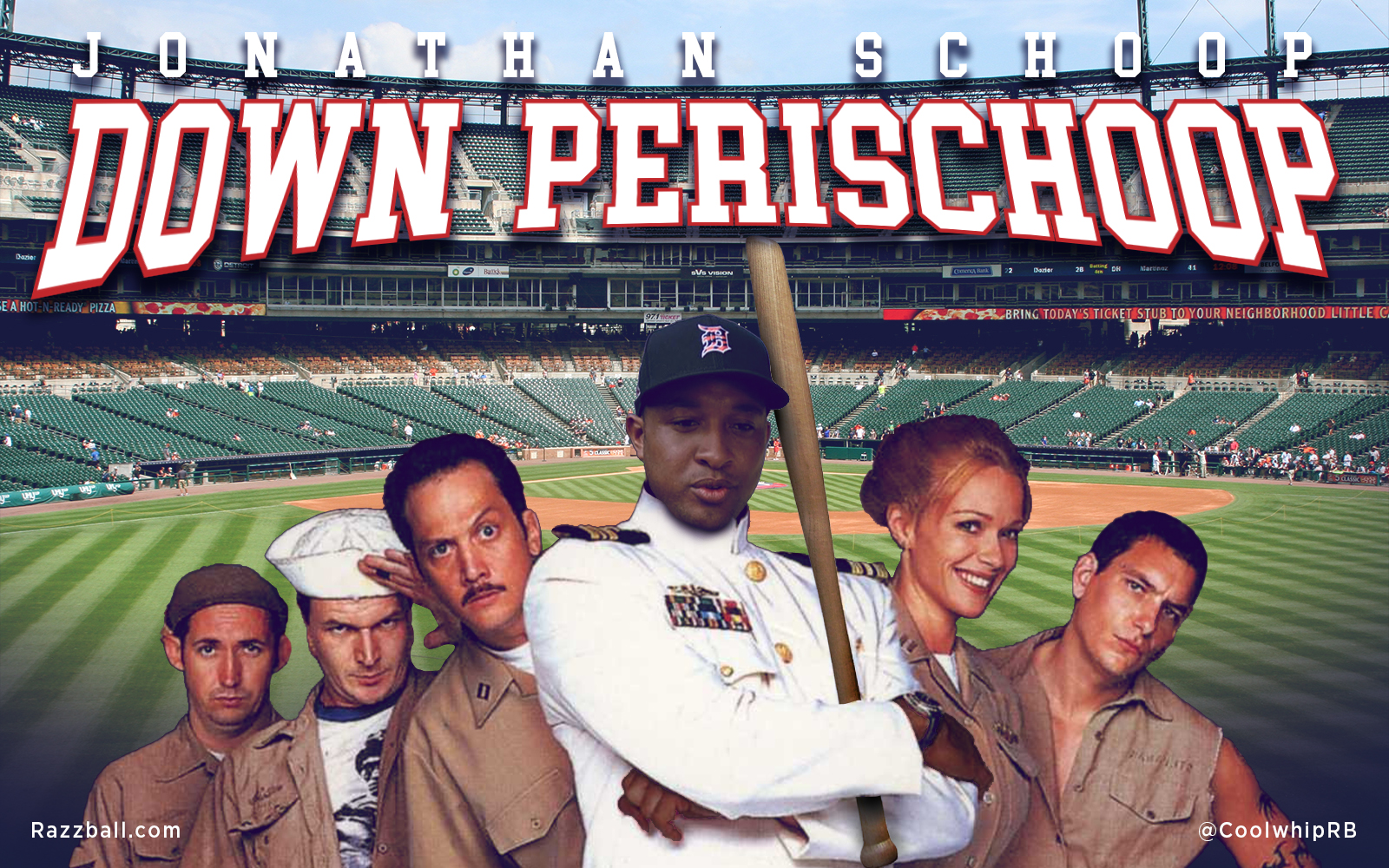
Is it already time for my Jonathan Schoop pickup post this year? Geez, time does fly. Like your mother! What does that mean? I thought I heard she was a flight attendant. If not, I’m so sorry. Like your mother! What? I thought I heard she was very polite and always said sorry. Guess she’s a terrible person. My bad, was trying to be nice. So, Schoop, rhymes with dope, not Shoop, Shoop-e-doop. Uh, here I go, here I go, here I go again. Five girl readers, what’s my weakness? Men (who play baseball)! Damn it! I promised myself I wouldn’t make any allusions to Salt-N-Pepa. By the way, George Clooney has really nice hair. What color is it? SALT AND PEPPER! God damn it! Okay, so Schoop has cut his Ks (minimally), but is hitting better than usual with a much flatter swing. Considering how much he would loft the ball vs. now? I think he can get power and average with his new swing. Maybe call it the New Jonathan Swing — Tony! Toni! Tone! says Feels Good! If nothing else, Schoop is worth rostering because he’s A) Not rostered in nearly enough leagues. B) Showing off a new swing that’s working for him, and is around a top 10 2nd baseman on our Player Rater. C) There’s no C. D) There was no C, why would there be a D? E) Grumbles F) Me, stop listing letters! Anyway, here’s some more players to Buy or Sell this week in fantasy baseball:
Please, blog, may I have some more?Welcome again sports fans to the midseason episode of Top 75 Outfielders for 2020 Fantasy Baseball, a continuation of the series that left off with last week’s Week 3 Update. With roughly 30 games left to go for the majority of teams not named the Marlins or Cardinals, now’s the time to separate the wheat from the chaff. Some guys have been just garbage *cough* Oscar Mercado, goodbye for this season. Some have injuries to account for with simply not enough time to get right. Also, there are early-season overperformers who would normally trail off during an extended season, but with only a month left to go many could coast on through the finish line. Plus full-on breakouts to account for as we shake things up and embrace the strange.
Here’s what I’ve been seeing around the league:
Please, blog, may I have some more?