
One thing to know about me is I love a good scatter plot. The sight of a bunch of circles plotted along carefully selected measures that represent the x-axis and y-axis, with oddly placed circles showing some type of oddity or superior achievement, and a cluster of circles showing some similarly grouped players or teams, has gotten my jollies for years. If you think I haven’t made a baseball stat post with a scatter plot over the years…
2022
2023
2024
2025
My go-to tool has been the baseball savant custom leaderboard tool. It’s a versatile page that lets you easily pull a leaderboard based on all the standard and statcast metrics you can find on the website, filter by minimum PA (or BF), and then create a scatter plot and even highlight certain points in red if you click on them. For years, I relied on this basic tool for insights, and then in 2024, Baseball Savant came out with bat tracking metrics (which I wrote about back then here). A part of that release came their Bat Tracking Leaderboard, which not only plotted circles (a beautiful thing) but even included the picture of the player for each circle. The most disappointing part of this new feature was that the Statcast team didn’t upgrade the original scatter plot tool to plot everyone’s faces on all of these charts.
Fast forward to 2026, with the introduction of tools like Claude Code, we now have the ability for jamokes like myself to develop online tools with nothing but a dream and a github account. This leads us to the purpose of this article, introducing the Scatter Plot Tool that will let you take any hitting or pitching stats (or even combined at a team level) available on Fangraphs, and create a nicely formatted scatter plot. To previously do something like this, you had to export the data from the website and manipulate it using Excel, but with this tool, anyone can instantly create their own scatter plots at home using up-to-date data and all the fancy metrics you can find online.
Let’s walk through some examples of queries on the scatter plot tool:
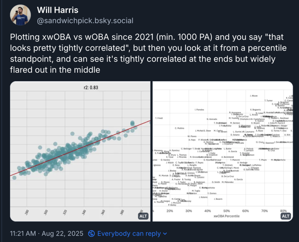
Plot #1: xwOBA vs wOBA for qualified hitters
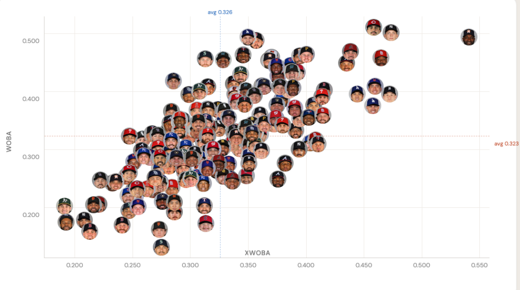
This is the gold standard scatter plot, the reason we plot to begin with. xwOBA is supposed to give us an estimate of what a player’s wOBA should be, and of course, wOBA (for those unaware) is a more calculated version of OPS (since OPS gives too much weight to SLG). Theoretically, since xwOBA was literally created to estimate wOBA, in a perfect world, the line of players would be lined up in a diagonal line going from left bottom to right top (basically xwOBA = wOBA), but of course, we see above where other factors come into play.
Looking at the bottom right, you can see some “unlucky” players like Michael Harris II and Ronald Acuna Jr., to the very right, some justification for buying into the breakouts of Francisco Alvarez, Dillon Dingler, and Jordan Walker. In the top left are some “overachieving” names like Mauricio Dubon, Christian Yelich and Chandler Simpson (though Simpson’s could be speed related), at the very bottom is Josh Naylor showing some signs that he has been better than what we have seen, and finally the dunce corner on the bottom bottom left corner are Cedric Mullins, Jacob Wilson, Jose Cabellero and Caleb Durbin (just bad, bad, bad). It’s a great way to instantly gauge where a player you’re concerned about lands on the batting spectrum.
Plot #2: SIERA vs ERA for starting pitchers (min. 10 IP)
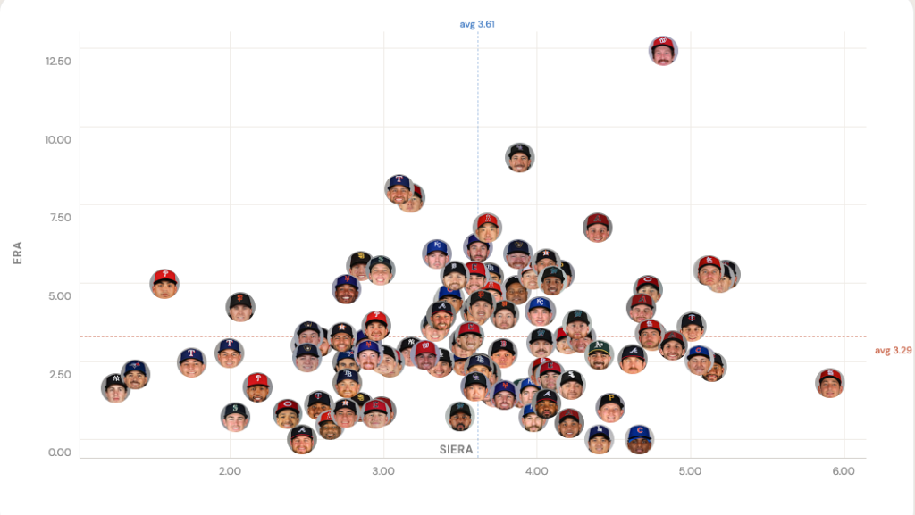
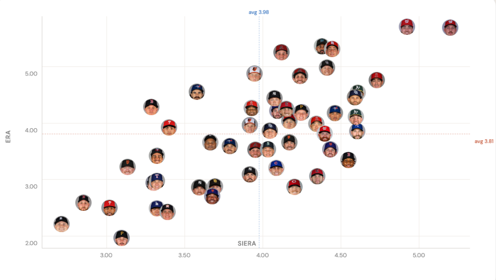
This is similar to Plot #1, but for pitchers, and while we do have an xERA metric, it has been found that SIERA is more predictive than the statcast cousin of xwOBA. Normally, this plot would show qualified pitchers, but since it is early in the year, we are going with a minimum 10 IP to include #3 through #5 starters that still haven’t made their third start. Just like we did with the first plot, if SIERA were perfectly predictive, we should see this graph settle to a diagonal line that goes from bottom left to top right (SIERA = ERA), which is pretty close to what the 2025 full-season version of this graph looks:
Looking at the similar corners like we did the first time, it stands out that Cam Schlittler has the lowest SIERA in the league, backing up his dominant start. It’s also interesting to see Ohtani hanging out in a potential regressive corner (above average SIERA, very low ERA), and finally, I’m not sure why Bryce Elder’s face appears next to these good pitchers:
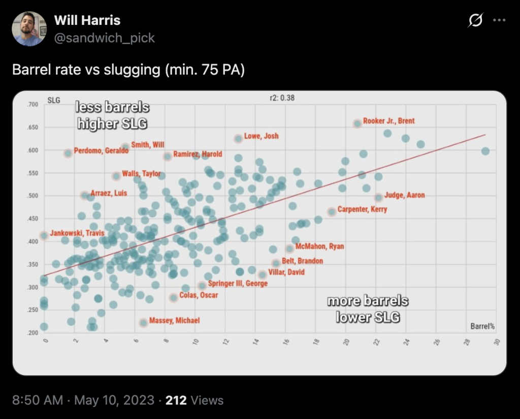
Plot #3: Barrel% vs Slugging Percentage for qualified hitters
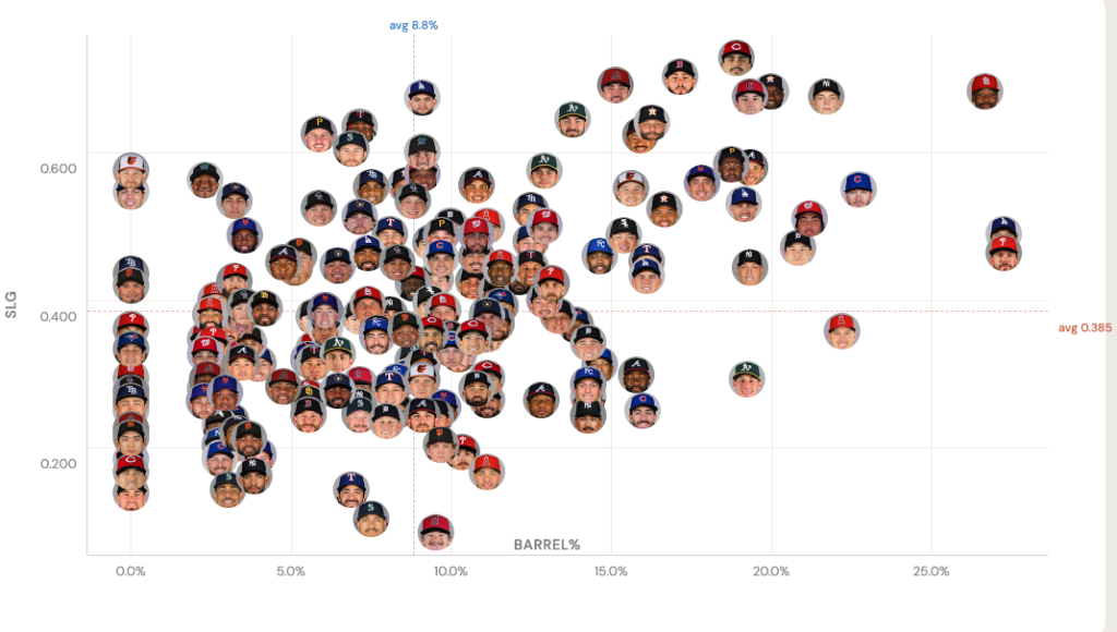
Here is where we start to break down individual characteristics of a player’s stat line against the underlying skill. We know barreling the ball is correlated to a higher slugging percentage (more extra base hits). So, creating a scatter plot like this lets us see if there are players with high slugging percentages that we assume must be mashing the ball, but in reality are not barreling the ball at all. Looking to the left top and see Taylor Ward leading the charge with an impressive .574 coming into Friday (4/10), but it turns out is yet to hit a single barrel. This is less concerning for guys like Nico Hoerner or Xavier Edwards around Ward, who have always overperformed their contact ability.
Plot #4: Stuff+ vs Innings Pitched (Rays relievers only, Min. 1 IP)
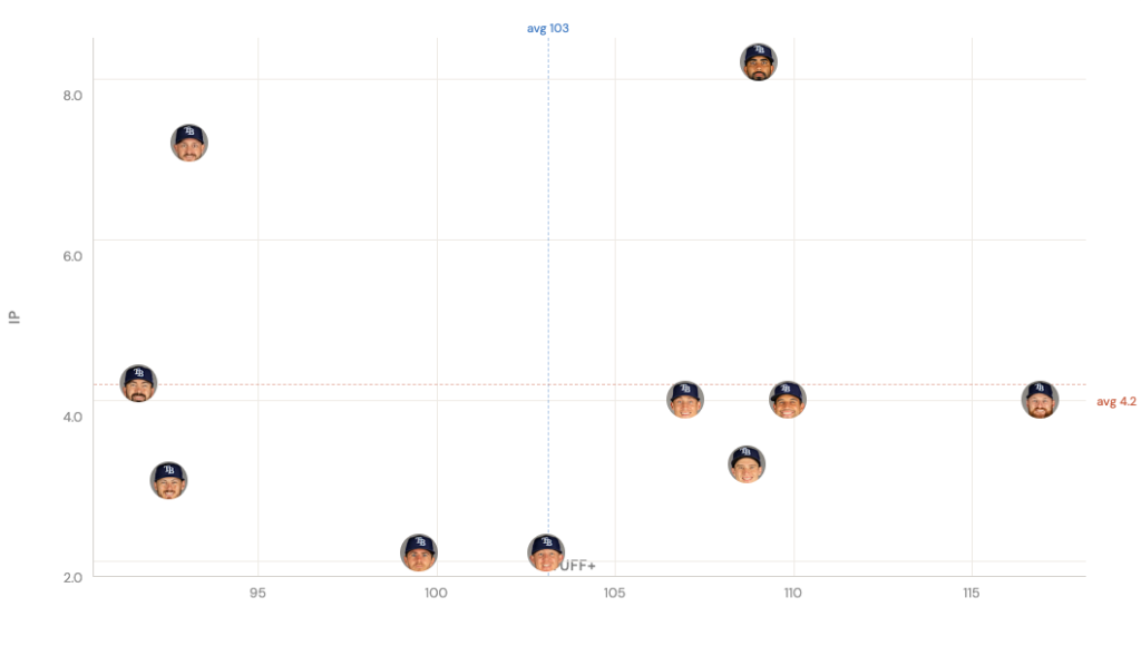
Now we get into a high-level, fantasy-specific situation. Here is a breakdown of Rays relievers showing two things: A) Who has pitched the most, and B) Which pitchers have the best stuff+ numbers. The reason I wanted to show this in scatter plot form is you can see the groupings here. The two guys with the most innings pitched (Cole Sulser and Yoendrys Gomez) are the swing men with the most innings pitched, Jesse Schlotens and Mason Englert have been used but are low stuff+, Griffin Jax, Ian Seymour and Kevin Kelly are higher stuff+ and finally there is Bryan Baker who appears to be the stuff king, which I have been previously written is a good sign of being the closer heir apparent.
Plot #5: wRC+ (hitting) vs ERA (pitching) for all team
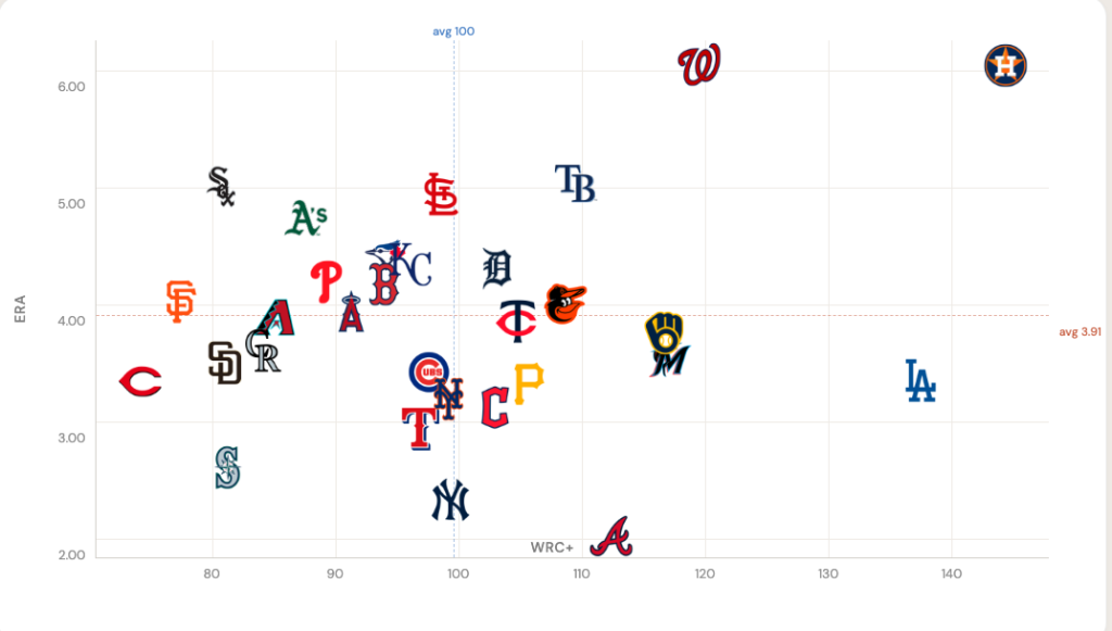
This last one is more fun since I haven’t seen any other website post a tool that tries to visualize where a team ranks both offensively and defensively in one chart. It’s been incredible how similar Nationals and Astros have been as far as both having a great offense but terrible pitching to start 2026.
Very cool tool! Nice work. Will definitely be checking it out.
My favorite is the bullpen chart, I really appreciate you sharing the link so I can simply change teams to view their situation.
Now I feel like I should give you something :)
What a great column!!!
I am in a 10 team Yahoo Points league. In the last few years, I have finished 4th, 1st, and 2nd. I am now in last place – that hurts!
Not one of my better nights in starting pitching:
I started Early and Imai and sat Baz.
On the wire is:
Steven Matz,
Eduardo Rodriquez
Landen Roupp
Casey Mize
Below is my staff:
3.Do you have any any thoughts for improvement?
4.How do you decide whether to start or sit?
5.Would you have started Early or Imai?
Logan Gilbert
Jacob deGrom
Framber Valdez
Cam Schlitter
MacKenzie Gore
Tatduya Imai
Shane Baz
Parker Messick
Will Warren
Randy Vasquez
Connelly Early
Grant Holmes
Ryan Weathers
Carlos Rodon IL 15 use IL slot
Thanks!!
Hey Martin!
Let me answer your question in bold below
What a great column!!!
I am in a 10 team Yahoo Points league. In the last few years, I have finished 4th, 1st, and 2nd. I am now in last place – that hurts!
Not one of my better nights in starting pitching:
I started Early and Imai and sat Baz.
On the wire is:
Steven Matz,
Eduardo Rodriquez
Landen Roupp
Casey Mize
Below is my staff:
Logan Gilbert
Jacob deGrom
Framber Valdez
Cam Schlitter
MacKenzie Gore
Tatduya Imai
Shane Baz
Parker Messick
Will Warren
Randy Vasquez
Connelly Early
Grant Holmes
Ryan Weathers
Carlos Rodon IL 15 use IL slot
Thanks!!
Thank you so much for this detailed response!!! I can’t thank you enough!!